Decision Making
Made Easy!
Decision Making
Made Easy!
Decision Making
Made Easy!
Decision Making
Made Easy!
Decision Making Made Easy!
Decision Making
Made Easy!
Decision Making
Made Easy!
Decision Making
Made Easy!

Decision Making
Made Easy!
Decision Making
Made Easy!
Problem
How might we help indecisive groups of people who feel overwhelmed choosing between certain options, when they face a lack of confidence in their decisions?
Goal
Create a platform for users to post their decisions online for friends and members of the App's community to vote on and provide feedback.
Vision
Using a feed like Tinder's, create an interface for users to vote quickly on low-impact decisions. Allow users to post to this feed and view results of decisions the post or vote on.
Design Process
Double Diamond
Our design process followed the double diamond model, allowing us to build a strong understanding of our design problem before beginning brainstorming. After this, we were able to cycle through designing and testing to deliver a final product we are proud of.
Work Scope
Discover
-
Competitive Analysis
-
User Interviews
-
Key Insights

Define
-
Personas
-
Storyboards
-
Sketches
-
Personas
-
Storyboards
-
Sketches
Develop & Deliver
-
Wireframing
-
Mid-Fidelity Prototype
-
User Testing
-
Final Prototype


In conducting our competitive analysis, we looked at properties such as depth of response, response speed, choice variety, and user review insights.
From our analysis, we found that the market is lacking a system for broadcasting decision polls out to both specific friends/ colleagues as well as to the system's user base. Most of the systems we analyzed also do not provide the original poster with much insight on the result data from the responses.
Key Insights
From our initial interviews, we found 5 key pieces of insight from our interviewees. We conducted 8 total interviews with people who self-identify as someone who chronically struggles with decision making. The full list of interview insights can be found here.
2
Users enjoy feedback on their decision making, preferably from friends and family
We found out that our interviewees tend to feel safe when they discuss their decisions with people who they trust, because friends and family members know the interviewees' situations better.
4
Users like to know the outcome of their decisions so they can gauge which one they prefer
We found it's hard for people to make decisions when they don't know the outcome. That's because they always consider the pros and cons of different outcomes to make decisions.
1
Users feel that group decisions are harder than individual decisions
We found that our interviewees faced more difficulty making group decisions because they try to go with the choice that makes everyone happy, rather than what makes them happy.
3
When users lack time, they tend to omit reason and go with their gut
We found that when people are lacking time, they just make reasons with their gut. They do this because they think about the options too much and just decide what they feel is right.
5
Users prefer fewer choices, too many choices can be overwhelming for them
We found that people prefer fewer choices due to the decrease in difficulty provided by a more narrow area of focus, the fewer amount of outcomes they must predict, & the lower chances of becoming overwhelmed and dissatisfied.
Personas
Initially, our problem statement asked how we could help indecisive individuals with making choices. But from our interviews, we found that many people struggled with making group decisions more than making decisions by themselves. With this insight, we narrowed the scope of our problem statement and decided to focus on people who struggle with group decisions.


Sketches
We learned that people enjoy feedback from friends and family (insight 2), so we explored social features as well as voting. Because voting allows us to gather opinions from multiple people, it also serves as a way to address indecision in group decisions (insight 1).
We've considered what it might be like to allow others to add comments when voting, because in real life, feedback is often more than just a binary answer. If a person knows the reasoning behind the suggestion, they may have a better idea of the consequences of their choices and be more equipped to make a better decision (insight 4).
We also briefly explore narrowing down the users' options by using a tournament bracket (insight 5).


Home

Profile

Feed

Results
Mid-Fidelity Prototype
Mid-Fidelity Prototype
Mid-Fidelity Prototype
Mid-Fidelity Prototype
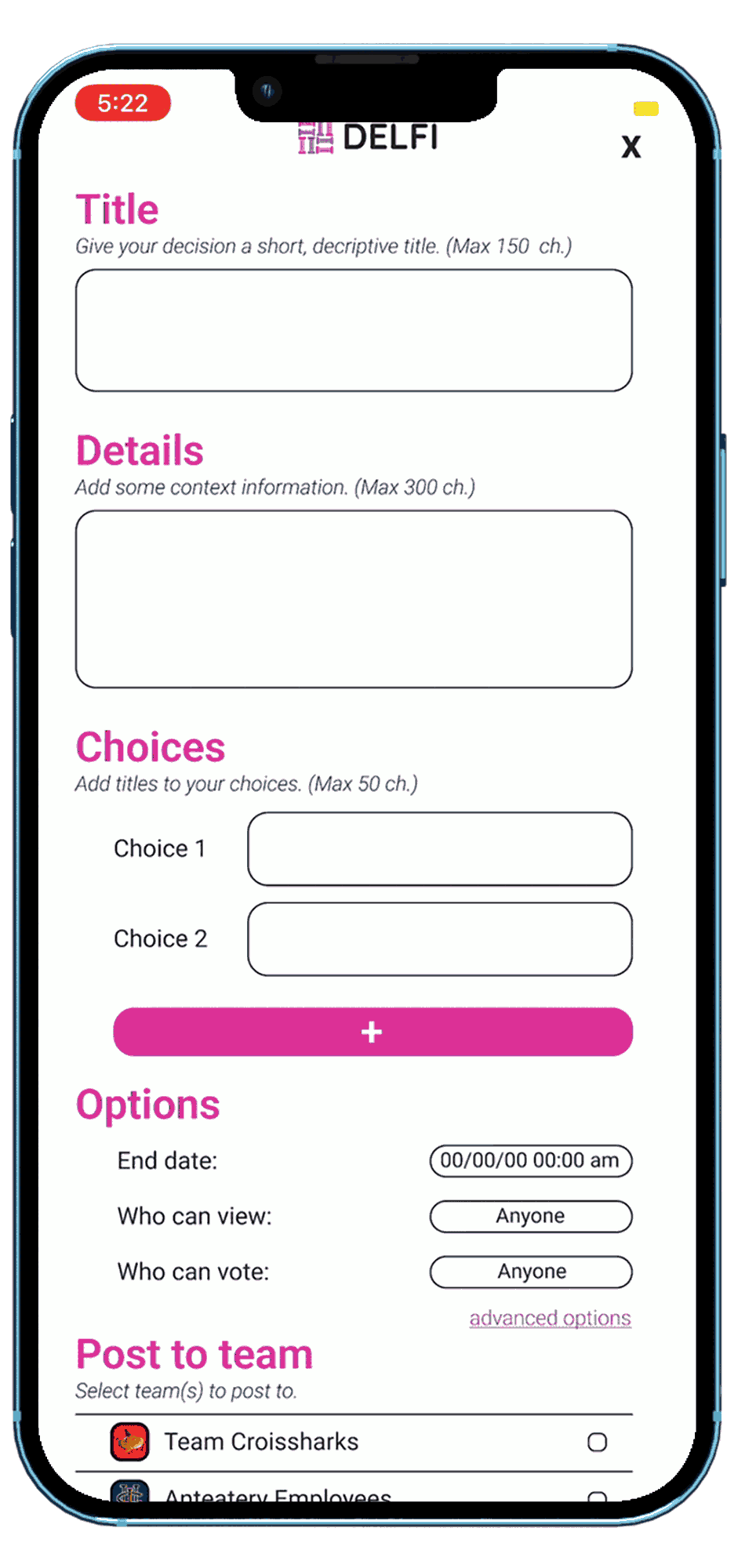
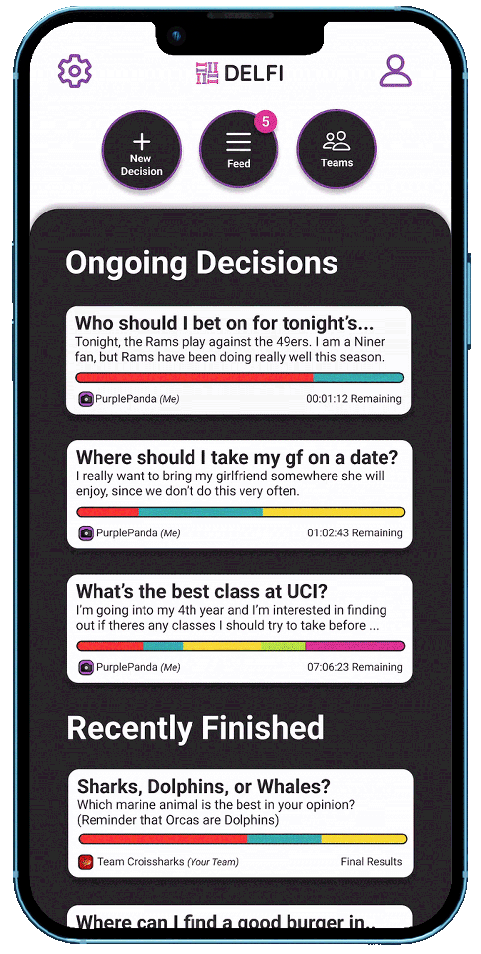
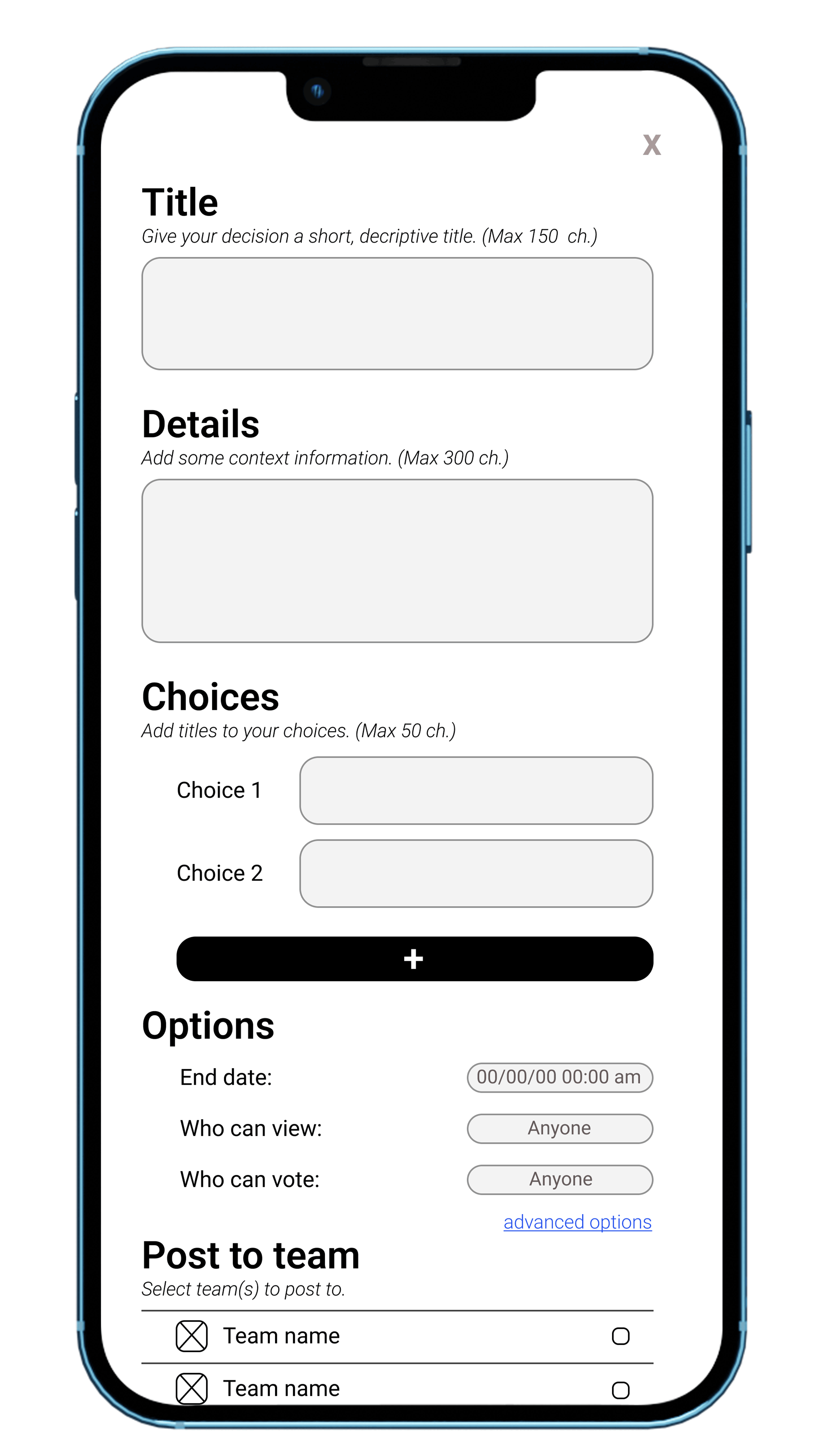
In our middle-high fidelity prototypes, we honed in on the concept of voting. From the home page, users would be able to post polls in order to get votes for their own decisions. These users can choose who to receive votes from. So if users wanted votes from specific friends or family, they can specify that while creating the poll.
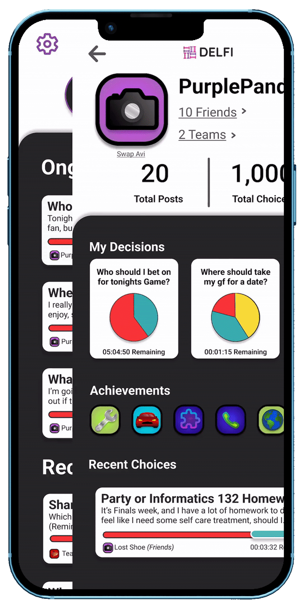
The social feature has taken on more shape, and users can have friends or teams (in a company setting). All of this can be accessed from the user's profile.
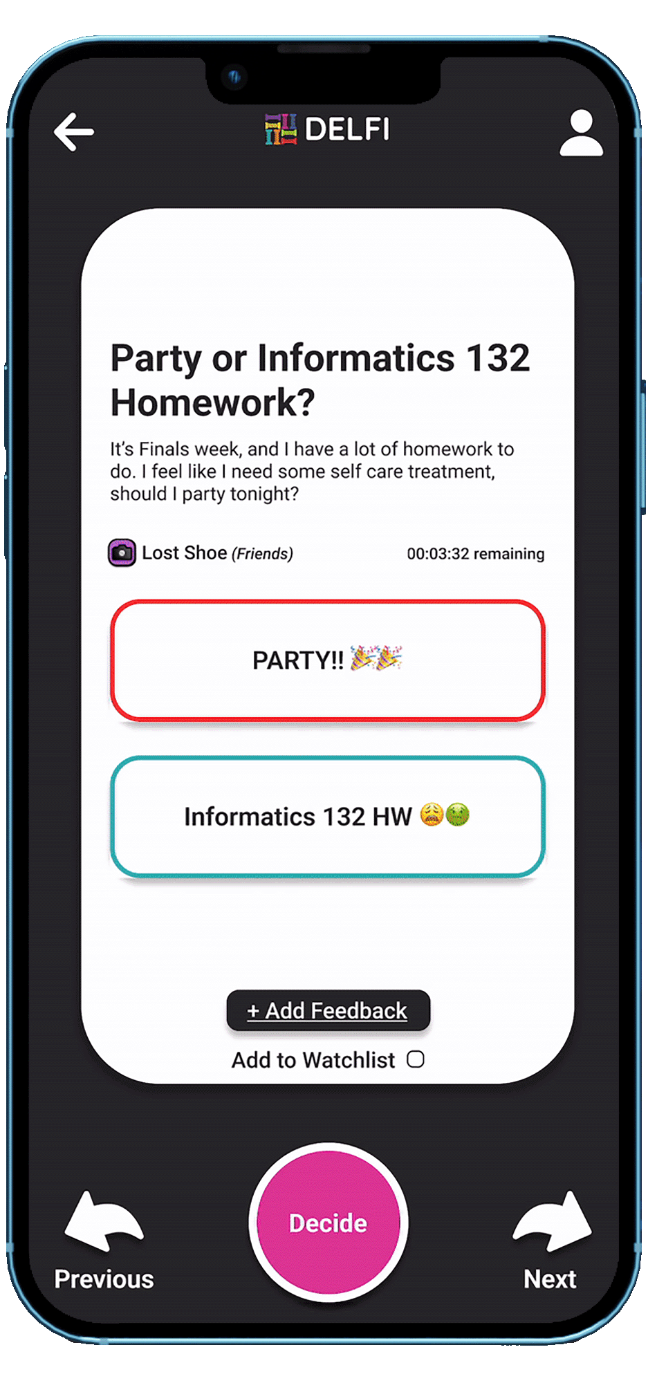
Users would also be expected to vote on polls for decisions for others. They can access these polls from the feed from home page. And there, they would have a queue of questions to vote on. We made sure to allow users to provide "feedback" with their votes, so that deciders know the reasoning behind the votes.
We added the option for a tournament bracket to help users narrow down their choices.
We added a timer (not depicted in the sketches) for the polls. By artificially limiting the amount of time others have to provide feedback, we hope to give the deciders more time to make an informed decision (insight 3).


Home
Create Decision
Feed
Results
Profile

Prototype User Evaluation
To evaluate our prototype, we had our users perform four tasks with our Figma prototype. As they performed the tasks, we noted the speed at which they performed the task as well as any affective signals they demonstrated while performing the task.
After they finished all tasks, we had a questionnaire where we asked the user for their overall impressions of doing each task in our application. From this analysis, we found:
-
Users found it difficult to find the tasks that were assigned to them.
-
A few users wanted to be able to share the results with multiple people at once.
-
A few users found the buttons to be too small and the screen to be too cluttered
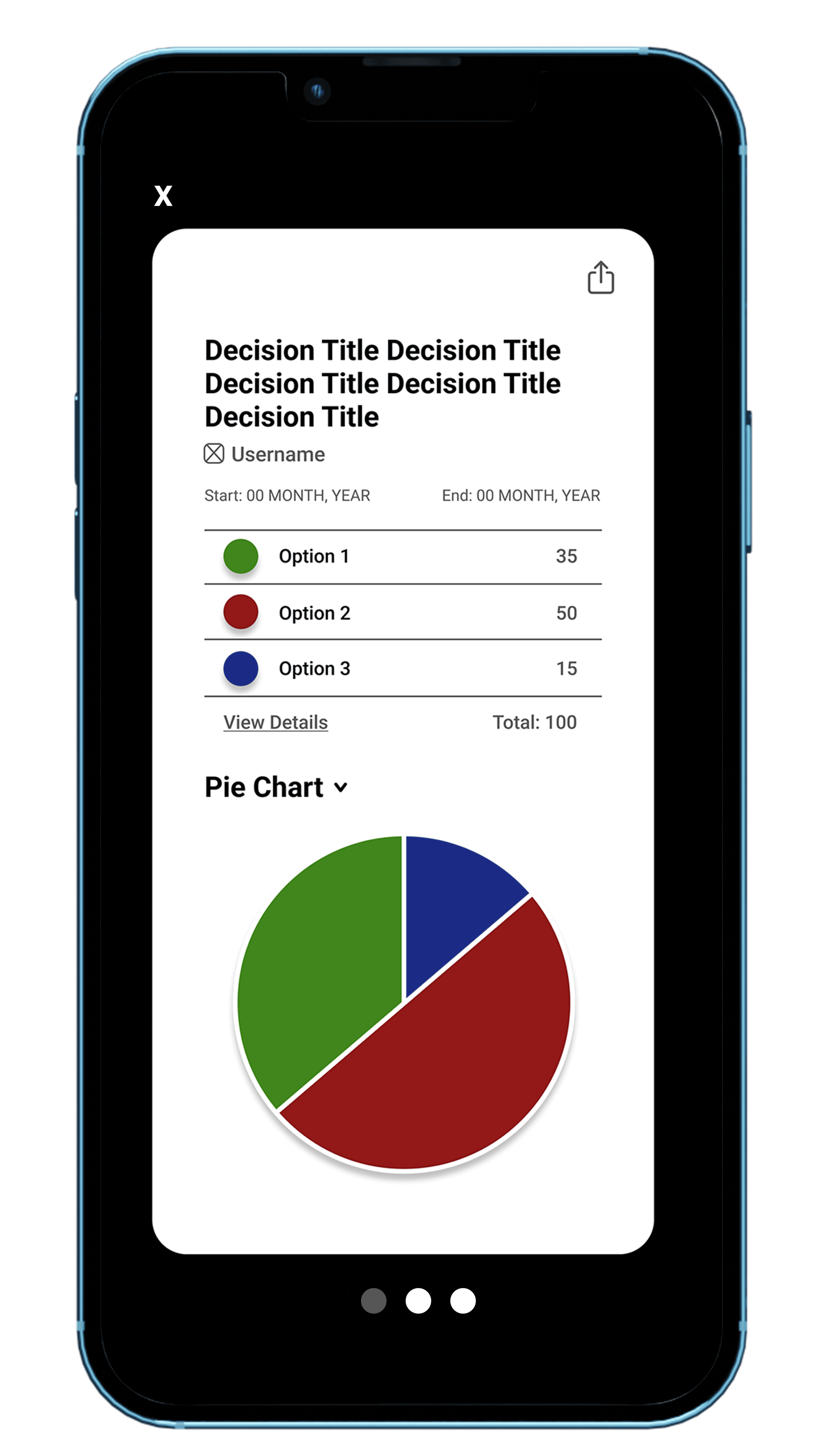
Final Prototype
In our high-fidelity final prototypes, we established a name and a logo with a color scheme to style our app around. The name "Delfi" comes from the name of a method of team decision making called the "Delphi Method". This is a decision making method for teams where they look for input and advice from outside experts. We felt this fit our app well as we seek to do the same thing. The logo is a series of 8 roman columns arranged in a square to represent the 8 possible choices users can add.
Our prototype is very interactive and most features work! Below you can see the main screens and click on them for more information. There is also a demo video with the Figma prototype embedded beside it at the bottom of the page.

* Click on a screen to view more information

Home